How To Make Double Bar Graph In Google Sheets

Want to visually compare two sets of data? Double bar graphs are the perfect tool. Let’s look at how to create a double bar graph in Google Sheets, from data input to chart customization. Will also share some tips on visualizing your data faster and easier using AI.
Steps How To Make a Double Bar Graph in Google Sheets
Time needed: 2 minutes
- Prepare Your Data
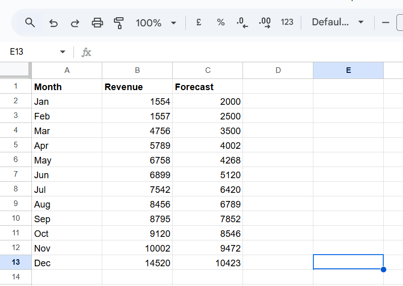
Organize your data into columns. The first column should contain the categories you want to compare (e.g., months, products, locations). The subsequent columns should contain the numerical data for each category, representing the two sets of data you want to compare.
- Select Your Data
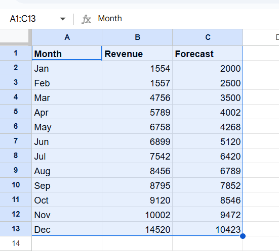
Click and drag your mouse to select the entire range of data, including the category labels and numerical values.
- Insert a Chart
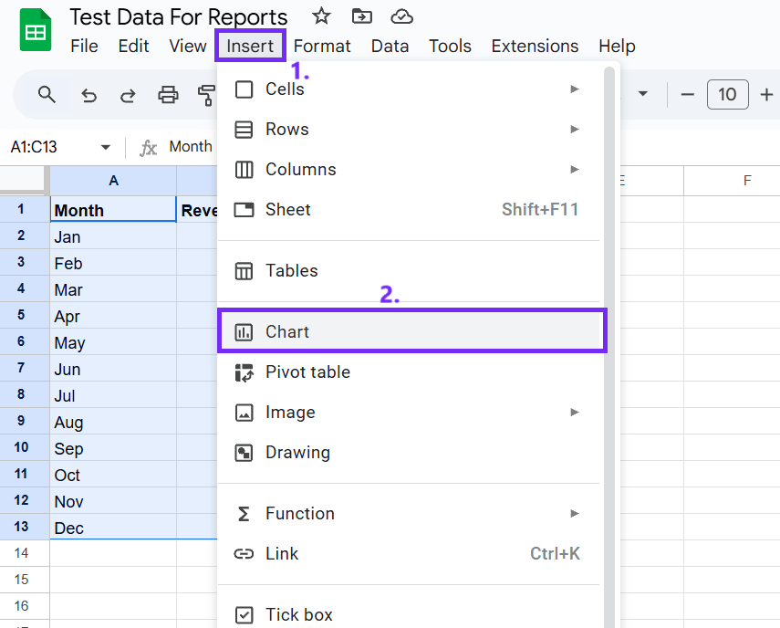
Go to Insert > Chart. Google Sheets will automatically suggest a chart type.
- Customize Your Chart
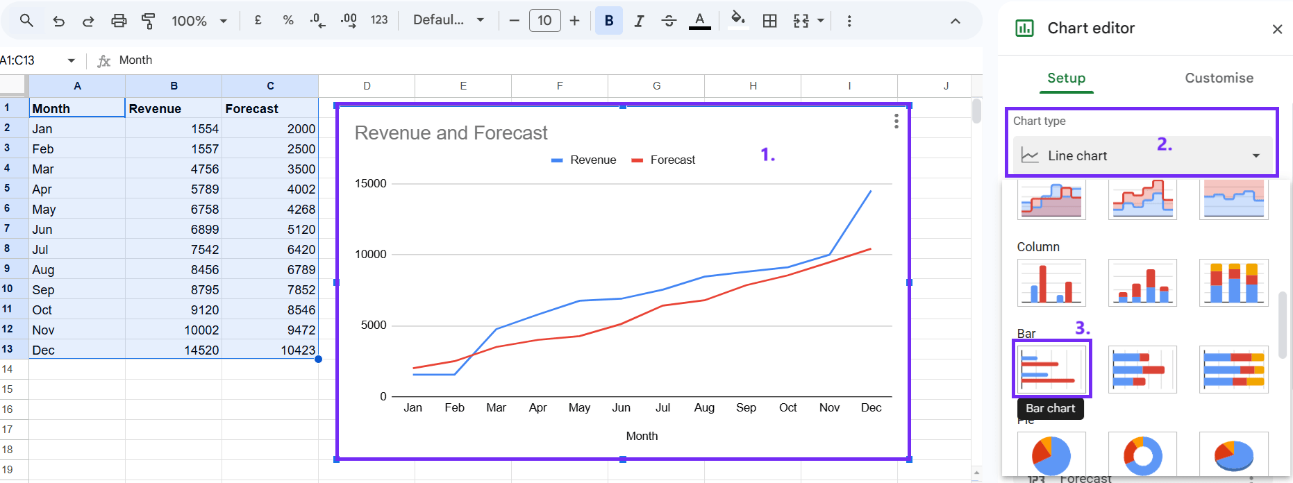
A chart editor will appear on the right side of your screen. Click on the chart type dropdown menu and select “Bar chart.” You can further customize your graph by changing colors, adjusting legends, and setting up your visualization.
Create a Double Bar Graph With AI
If you want to skip the hassle with chart creation in Google Sheets you can use artificial intelligence tools that let you write prompts and generate charts quickly and easily. Here’s how it works:
#1 Choose An AI Tool
Many AI tools can be used to create double-bar graphs. The easiest selection is an online graph maker that can create charts super fast. Another alternative is the Ajelix AI graph generator.
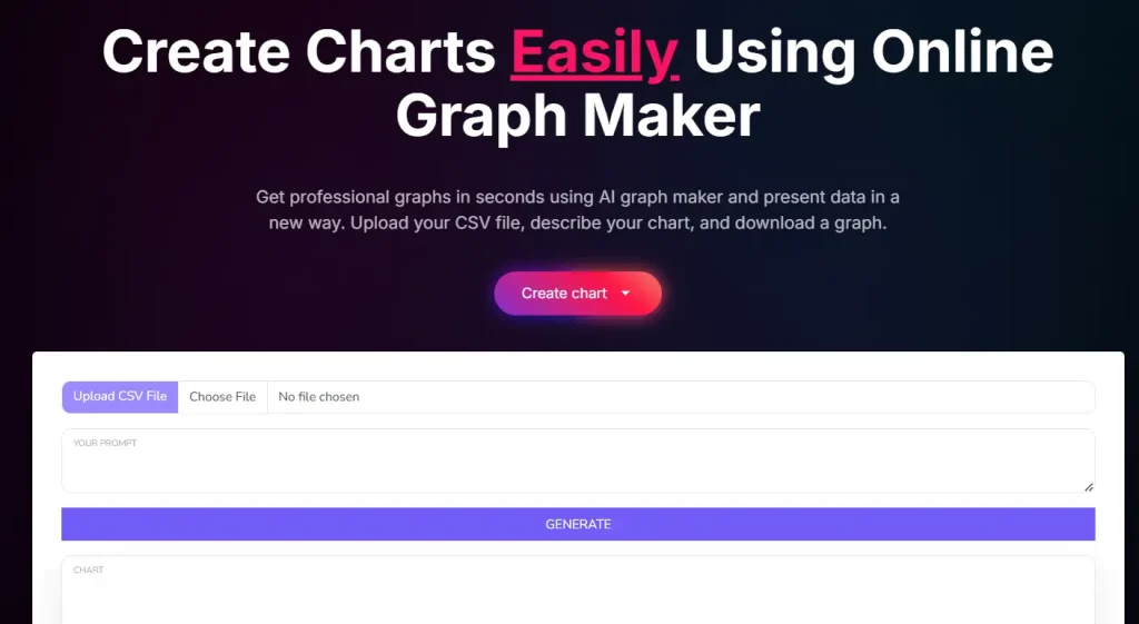
#2 Upload Your Data
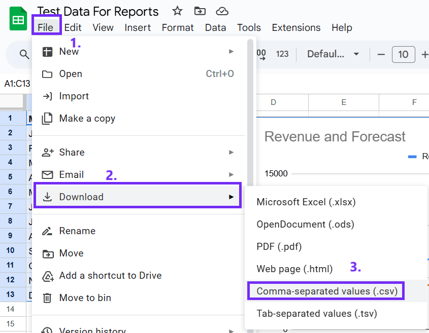
This tool allows you to upload your data using CSV files. You can easily convert your Google Sheets file to a CSV file, here’s how: go to File, select Download, and click Comma-separated values (.csv).
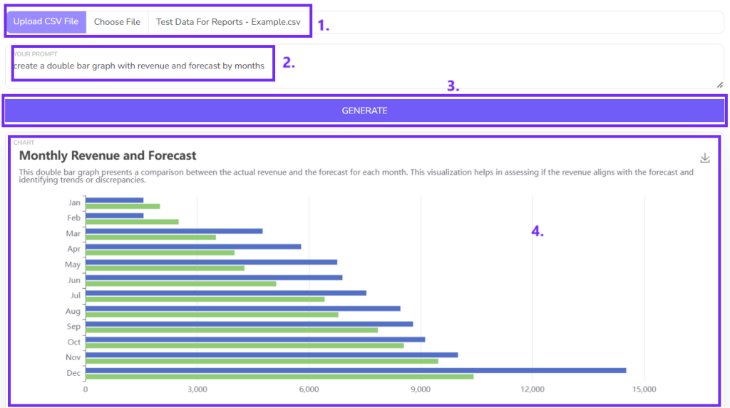
#3 Write a prompt
The prompt is a description of the image you want to generate. It should include the following information:
* The type of graph you want to create (double bar graph)
* The data you want to include in the graph
#4 Generate the image
Once you have written your prompt, you can submit it to the AI tool. The tool will then generate an image of the double bar graph based on your prompt.
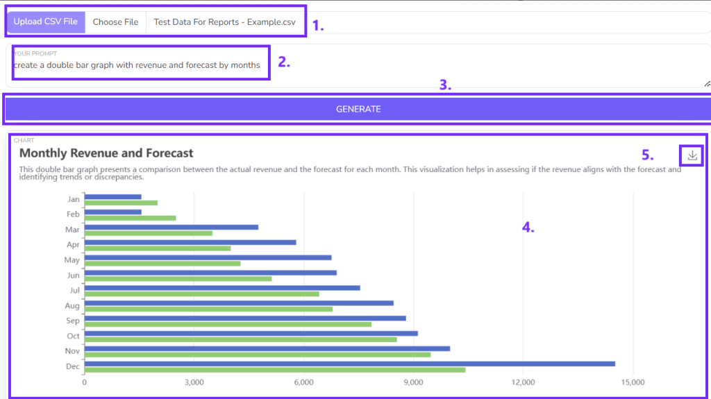
#5 Download the image
Once the image has been generated, you can download it to your computer.
Here’s a quick video overview of how this works:
FAQ
To add data labels, right-click on the chart, select “Chart Editor,” and then navigate to the “Series” tab. In the “Series” section, you can enable data labels and customize their appearance.
Yes, you can change the order of the bars by adjusting the order of the categories in your data table. Simply rearrange the rows or columns in your data range.
While double bar graphs are primarily used for comparison, you can add a trendline to show the overall trend of one or both data sets. To do this, right-click on a data series, select “Trendline,” and choose the desired trendline type.
-
Author:
-
Posted:November 12, 2024


