How To Make A Cost Volume Profit Graph In Excel

Are you struggling to visualize your business’s profitability? A Cost-Volume-Profit (CVP) graph is a powerful tool for understanding the relationship between costs, volume, and profit.
This article will provide steps for creating a CVP graph in Excel, to help you make informed business decisions.
Make A Cost Volume Profit Graph In Excel
Time needed: 3 minutes
Here’s a step-by-step guide on how to create a Cost Volume Profit (CVP) graph in Excel:
- Gather Your Data
1. Fixed Costs: Costs that remain constant regardless of production or sales volume (e.g., rent, salaries, insurance).
2. Variable Costs per Unit: Costs that change directly with the production or sales volume (e.g., direct materials, direct labor).
3. Selling Price per Unit: The price at which you sell your product or service.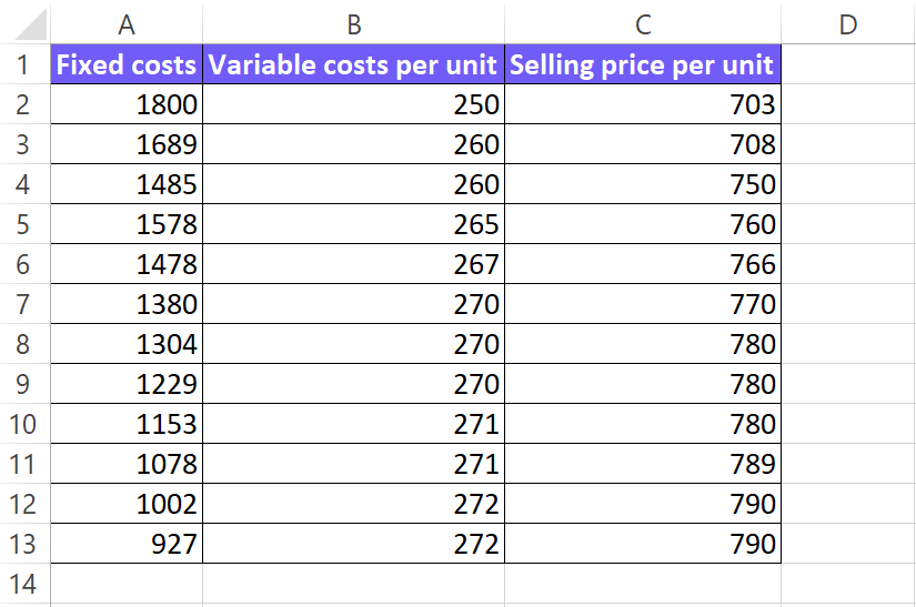
- Set Up Your Excel Spreadsheet
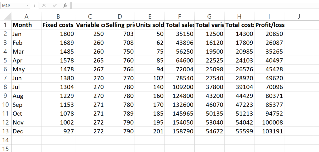
Create Columns and label them as follows: Units Sold, Total Sales Revenue, Total Variable Costs, Total Costs, Profit/Loss.

- Calculate Values
Total Sales Revenue: Units Sold * Selling Price per Unit
Total Variable Costs: Units Sold * Variable Cost per Unit
Total Costs: Fixed Costs + Total Variable Costs
Profit/Loss: Total Sales Revenue – Total Costs
In the remaining columns, input the corresponding formulas to calculate the values for each row.
- Create the CVP Graph
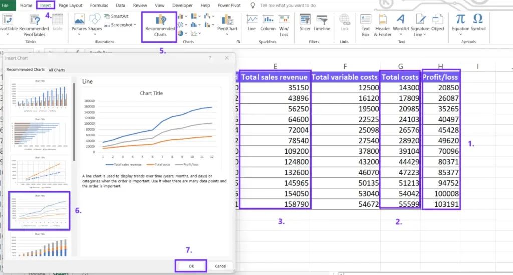
Highlight the “Units Sold” column and the “Total Sales Revenue,” “Total Costs,” and “Profit/Loss” columns. Go to the “Insert” tab and choose a line chart type.
- Customize Chart
Axis Labels: Label the x-axis as “Units Sold” and the y-axis as “Dollars.”
Chart Title: Add a clear title, such as “Cost Volume Profit Analysis.”
Legend: Customize the legend to identify each line (e.g., “Total Sales Revenue,” “Total Costs,” “Profit/Loss”).
Formatting: Adjust the chart’s colors, line styles, and font sizes to enhance readability.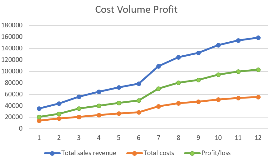
- Analyze the CVP Graph
Break-Even Point: Identify the point where the total revenue line intersects the total cost line. This is the point where the business neither makes a profit nor incurs a loss.
Profit Zone: The area to the right of the break-even point represents profit.
Loss Zone: The area to the left of the break-even point represents loss.
Margin of Safety: The difference between actual sales and the break-even point, indicating the cushion of sales before incurring losses.
Working on Google Sheets? Check our article about correlation graph and double-bar graph creation.
Make A Cost Profit Volume Chart With AI
Here’s a step-by-step guide to creating a Cost-Volume-Profit (CVP) chart using an AI graph maker.
1. Prepare Your Data
- Gather the necessary data:
- Fixed costs (e.g., rent, salaries)
- Variable costs per unit (e.g., cost of goods sold)
- Selling price per unit
- A range of sales volumes (e.g., 0 to 10,000 units)
- Organize your data: Create a table or spreadsheet with columns for:
- Units Sold
- Total Sales Revenue
- Total Variable Costs
- Total Costs
- Profit/Loss
We advise using the CSV file upload option for a better data visualization process.
2. Upload Your Data

Go to the online graph maker home page where you can create three charts without registration.
You can upload your data as a CSV file. To convert your Excel files as CSV click save as and select file type Comma delimited (.csv).
3. Write Your Prompt

Provide clear instructions: tell AI what kind of chart you want to create and what insights you’re looking for.
Example prompt: “Create a cost volume profit line chart by month”
Be specific: The more specific your prompt, the better the results. You can also provide additional details, such as chart title, axis labels, and desired colors.
4. Download the Chart
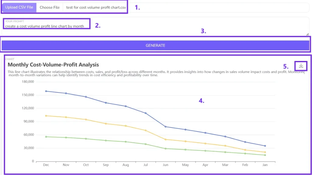
Export the chart: Once you’re satisfied with the chart, download it as a picture.
FAQ
A CVP graph is a visual representation of the relationship between a company’s costs, volume, and profit. It helps businesses understand how changes in these factors can impact their profitability.
You can calculate the break-even point using the formula: Break-even point (units) = Fixed Costs / (Selling Price per Unit – Variable Cost per Unit)
You can create multiple CVP graphs, each with a different selling price. By comparing the graphs, you can see how a price increase affects the break-even point and profit margins.
Yes, you can create a CVP graph for each product or service. However, you’ll need to consider the specific costs and revenues associated with each one.
-
Author:
-
Posted:November 16, 2024


