How To Make A Correlation Graph In Google Sheets

Ever wondered if there’s a hidden connection between ice cream sales and crime rates? Or perhaps you’re curious about the relationship between hours studied and exam scores?
With Google Sheets, you can create correlation graphs to see how different things impact each other clearly and concisely.
This article will explain how to make a correlation graph in Google Sheets and visualize data with AI for faster analytics.
Make a correlation graph in Google Sheets
Time needed: 5 minutes
6 steps to create a correlation graph in Google Sheets.
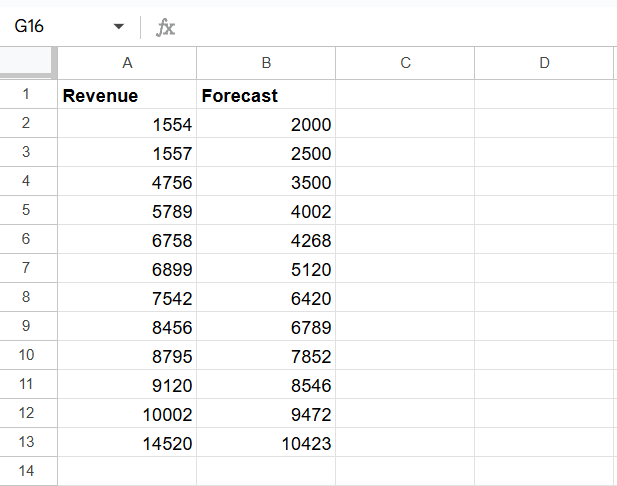
- Prepare Your Data
Organize your data into two columns, each representing a variable you want to compare. Ensure there are no missing values in your data.
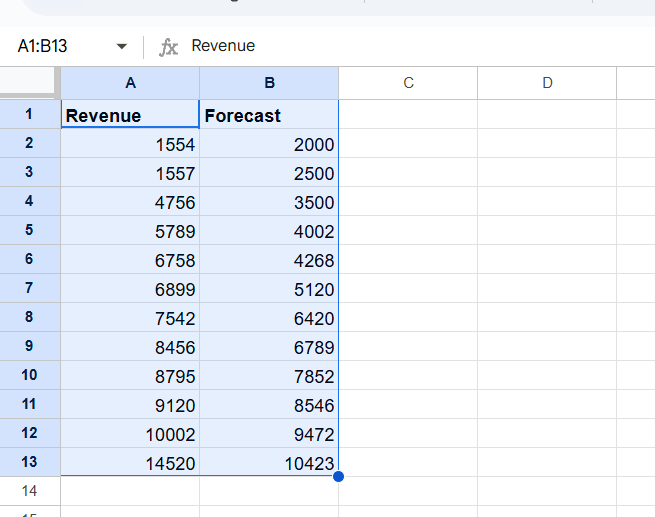
- Select Your Data
Click and drag your mouse to select both columns of data, including the header row.
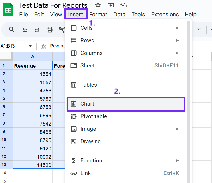
- Insert a Chart
Go to Insert > Chart.
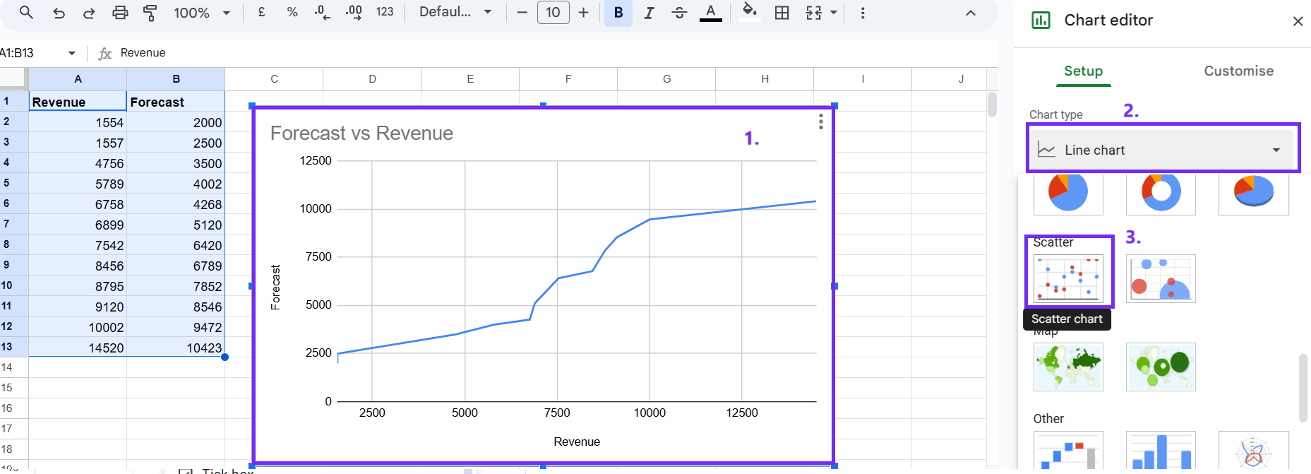
- Choose a Scatter Chart
In the chart editor, choose Chart type > Scatter chart. Make sure you’ve selected the chart to see these settings. Create a double bar chart in Google Sheets using our guide.
- Customize Your Chart (Optional)
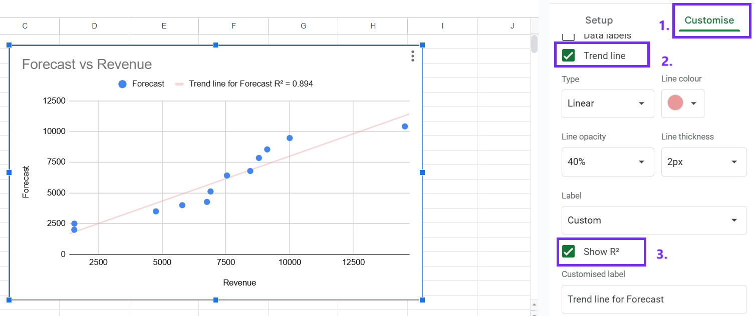
Click on the chart title and type in a descriptive name. To change horizontal and vertical axes select horizontal or vertical axis. To visualize the correlation, click on the Customize tab, then Series, and check the box for Trendline. R-squared value: To display the strength of the correlation, check the box for Show R^2.
- Interpret Your Graph
Positive correlation: If the trendline slopes upward, it indicates a positive correlation between the variables. As one variable increases, the other also tends to increase.
Negative correlation: If the trendline slopes downward, it indicates a negative correlation. As one variable increases, the other tends to decrease.
No correlation: If the points are scattered randomly with no clear trendline, it suggests no correlation between the variables.
Create A Correlation Graph With AI
Here’s a step-by-step guide on how to create a correlation graph using AI.
#1 Prepare Your Data
Organize your data and ensure your data is in a clear, organized format. This could be a CSV, Excel, or plain text file. Remove any inconsistencies, errors, or outliers that might affect the correlation analysis.
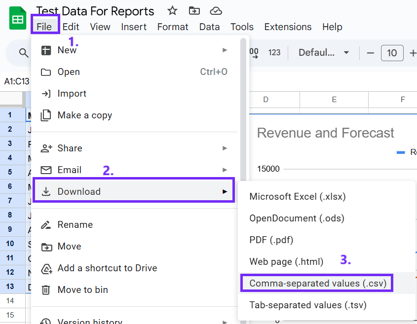
Use a CSV file for data upload, this way you’ll make fewer mistakes and get better results. You can easily convert your Google Sheets data into a CSV file. Go to File, select Download, and click Comma-separated values (.csv).
#2 Choose an AI Tool
Consider tools like Google Bard or ChatGPT, or specialized data analysis tools with AI capabilities such as an online graph maker that is more precise and easy to use.

#3 Upload Your Data
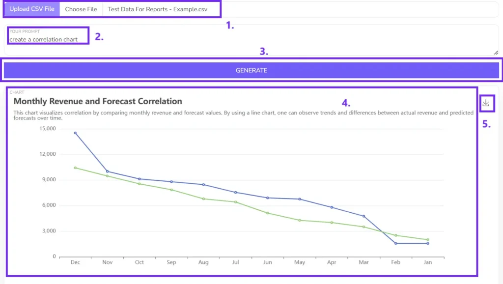
Upload your CSV file for better results.

#4 Write a Clear Prompt
Clearly state your goal: “Create a correlation graph between [variable 1] and [variable 2].”
Indicate the type of graph (scatter plot, line graph, etc.) and the level of detail you require (e.g., correlation coefficient, trendline).
Example: Analyze the correlation between ‘Sales’ and ‘Marketing Spend’ from the attached CSV file. Create a scatter plot and include a trendline.

#5 Submit the Prompt
Once you’ve crafted your prompt, click “Generate” so AI can create your chart.

#6 Download the Graph
Download a graph picture by clicking on the small icon.
FAQ
The R-squared value measures the proportion of the variance in one variable that is explained by the other variable. A value of 1 indicates a perfect correlation, 0 indicates no correlation, and negative values indicate an inverse correlation.
Outliers can significantly impact the correlation coefficient. You can identify outliers visually on the scatter plot or use statistical methods like Z-scores or interquartile range.
While Google Sheets doesn’t have a built-in function for correlation matrices, you can use the CORREL function to calculate pairwise correlations and then create a matrix using a pivot table or a custom function.
-
Author:
-
Posted:November 13, 2024

